
Hunky Dory (1971) – The Story Behind the Album Cover
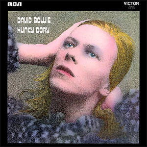
Image: David Bowie World collection / editorial use
Released in December 1971, Hunky Dory became the album where David Bowie finally discovered both his musical identity and his visual language. The cover perfectly reflected that transformation. Instead of science-fiction imagery or shocking theatrics, Bowie appeared as a glamorous, almost timeless Hollywood-style figure inspired by classic cinema photography and 1930s movie stars.
The sleeve introduced a softer and more elegant Bowie just before the explosive arrival of Ziggy Stardust. Today, the Hunky Dory cover is regarded as one of the most beautiful and sophisticated portraits in Bowie’s entire catalogue.
- Album: Hunky Dory
- Released: 17 December 1971
- Photographer: Brian Ward
- Artwork/colouring: Terry Pastor
- Visual inspiration: Hollywood glamour photography
- Location: Haddon Hall era / early Spiders period
- Label: RCA Records
The moment Bowie found himself
Hunky Dory arrived during one of the most important turning points in David Bowie’s career.
After years of commercial disappointment, Bowie finally began shaping the artistic identity that would soon make him internationally famous. The album introduced many of the themes, ideas and visual instincts that later exploded during the Ziggy Stardust era.
The sleeve reflected that confidence perfectly. For the first time, Bowie no longer looked like a young mod singer searching for direction. He appeared fully composed, theatrical and self-aware.
Photographed by Brian Ward
The famous cover portrait was photographed by Brian Ward.
Ward captured Bowie in soft lighting with carefully styled hair and a relaxed pose inspired by classic Hollywood publicity photography from the 1930s and 1940s.
Rather than appearing aggressive or futuristic, Bowie looks elegant, introspective and cinematic.
The Veronica Lake inspiration
One of the strongest visual inspirations behind the sleeve was Hollywood glamour photography, particularly images associated with actresses such as Veronica Lake and Greta Garbo.
Bowie admired old Hollywood portraiture and deliberately adopted its sense of mystery and beauty for the Hunky Dory cover.
The flowing hair, soft shadows and carefully angled pose transformed Bowie into something between a classic film star and an androgynous art figure.
Terry Pastor’s colour treatment
Although the original photograph was black and white, artist and designer Terry Pastor added the warm gold and sepia colouring that became one of the sleeve’s defining features.
The tinted effect gave the image a dreamlike and nostalgic atmosphere, almost like an old Hollywood print rediscovered decades later.
That subtle colouring helped separate the sleeve from the colder psychedelic imagery still common in late-1960s rock design.
A softer Bowie before Ziggy Stardust
What makes the Hunky Dory sleeve fascinating is that it sits exactly between two Bowie worlds.
The harder, darker rock image of The Man Who Sold The World had already disappeared, but Ziggy Stardust had not yet fully arrived.
The result is a transitional Bowie: romantic, theatrical, intelligent and visually experimental, but still calmer and more intimate than the alien rock star he would soon become.
The influence of Haddon Hall
Much of the music for Hunky Dory was written while Bowie lived at Haddon Hall in Beckenham with Angie Bowie.
The atmosphere of that period shaped the album strongly. Bowie was immersed in songwriting, visual experimentation, theatre, cabaret influences and new ideas about identity and performance.
That artistic freedom can be felt directly in the sleeve image.
Before the lightning bolt
Unlike later Bowie covers such as Aladdin Sane or Heroes, the power of the Hunky Dory sleeve comes from restraint rather than shock.
There is no dramatic costume, no science-fiction mythology and no aggressive pose. The image succeeds because of its elegance and confidence.
It quietly announces the arrival of a major artist without needing spectacle.
The first classic Bowie portrait
For many fans and critics, Hunky Dory contains the first truly iconic portrait of David Bowie.
Earlier covers had shown fragments of Bowie’s changing identity, but this was the first sleeve where music, image and personality seemed completely unified.
The cover feels timeless partly because Bowie is not trapped inside a specific trend. The image draws from cinema history, fashion photography and art rather than contemporary rock clichés.
The RCA era begins
Hunky Dory was also important because it marked Bowie’s first album for RCA Records.
The label saw enormous potential in Bowie and gave him more artistic freedom than he had previously enjoyed. The result was an album and cover that both felt more ambitious and fully realised than anything he had done before.
Within months, Bowie would push even further with The Rise and Fall of Ziggy Stardust and the Spiders from Mars.
Why the cover still works
The sleeve remains powerful because it avoids looking dated or overdesigned.
Instead of depending on visual gimmicks, it relies on pose, atmosphere, lighting and personality. Bowie appears both masculine and feminine, modern and nostalgic, vulnerable and controlled.
That ambiguity became one of the defining features of Bowie’s visual art throughout the 1970s.
The Original Back Cover
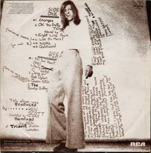
Image: David Bowie World collection / editorial use
The back cover of Hunky Dory continued the elegant and cinematic atmosphere established by the famous front sleeve.
Rather than presenting Bowie as a conventional rock performer, the packaging maintained the sophisticated Hollywood-inspired mood that defined the entire visual concept of the album.
The typography, photography and soft visual styling all reflected Bowie’s growing understanding that image and music could function together as one artistic statement.
Looking back today, the complete sleeve package feels like the final step before Bowie’s full transformation into Ziggy Stardust only months later.
Legacy
Today, the Hunky Dory cover is considered one of the great portrait sleeves in rock history.
It captures Bowie at the exact moment where his songwriting, visual imagination and artistic confidence finally aligned.
Without needing costumes or shock tactics, the image quietly introduced one of the most visually adventurous artists popular music would ever produce.
Article origin
This page was created using historically verified information surrounding the creation of the Hunky Dory album artwork, including documented material about Brian Ward’s original photography, Terry Pastor’s colour treatment and Bowie’s early RCA visual direction during the Haddon Hall period.
Additional historical context was drawn from Bowie archive material, contemporary interviews, documented sleeve-production information and research into the Hollywood glamour influences behind the album’s visual identity.
The page focuses specifically on the visual story behind the original Hunky Dory sleeve and its role in Bowie’s artistic transformation between The Man Who Sold The World and the arrival of Ziggy Stardust.