
Space Oddity (1969 / 1972) – The Story Behind the Album Cover
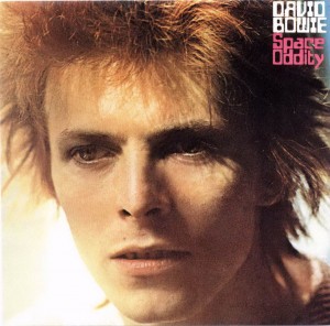
Image: David Bowie World collection / editorial use
Space Oddity has one of the most complicated cover histories in David Bowie’s catalogue. The album was originally released in the UK in 1969 under the title David Bowie, with a psychedelic portrait by Vernon Dewhurst set against an optical-art background inspired by Victor Vasarely.
After Bowie became famous through Ziggy Stardust, RCA reissued the album in 1972 under the title Space Oddity, replacing the original sleeve with a new Mick Rock photograph of Bowie in his Ziggy-era image. These two versions show two completely different Bowies: the searching young songwriter of 1969 and the newly famous glam icon of 1972.
- Album: David Bowie / Space Oddity
- Original UK release: 14 November 1969
- Original UK label: Philips
- US title: Man of Words / Man of Music
- 1972 RCA reissue title: Space Oddity
- 1969 front cover photograph: Vernon Dewhurst
- 1969 front cover concept: Bowie portrait over Victor Vasarely-inspired Op Art
- 1969 back cover artwork: George Underwood
- 1972 RCA reissue photography: Mick Rock
The album with two identities
The album now widely known as Space Oddity was not originally released under that title in the UK. In November 1969, it appeared simply as David Bowie, even though Bowie had already released another self-titled album in 1967.
That confusing title history became part of the record’s identity. In the United States, Mercury issued the album as Man of Words / Man of Music. In 1972, after Bowie’s breakthrough as Ziggy Stardust, RCA reissued it internationally as Space Oddity.
Because of those changes, the album also became associated with two major cover designs: the original 1969 psychedelic portrait and the 1972 Ziggy-era RCA sleeve.
1. The original 1969 UK cover
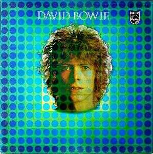
Image: David Bowie World collection / editorial use
The original UK sleeve featured a front-facing portrait of a young, long-haired Bowie photographed by Vernon Dewhurst.
The portrait was placed over a vivid optical-art background based on CTA 25 Neg by Victor Vasarely, one of the central figures of Op Art. The design created a vibrating, psychedelic effect that matched the late-1960s mood of the album.
This sleeve presents Bowie not as Ziggy Stardust or a fully formed rock icon, but as a searching young artist positioned somewhere between folk, psychedelia, theatre and science fiction.
Vernon Dewhurst and the Op Art effect
Vernon Dewhurst’s portrait gave the cover a direct, almost innocent quality. Bowie looks youthful and open-faced, with long hair and a calm expression.
The optical background radically changes that simplicity. Instead of a plain portrait, Bowie’s face appears to float inside a field of repeated circular shapes, creating a hypnotic visual tension.
The design reflected the era’s fascination with psychedelia, visual distortion and futuristic imagery. It also connected well with the album’s most famous song, Space Oddity, which had already linked Bowie to space-age themes in the public imagination.
The 1969 back cover by George Underwood

Image: David Bowie World collection / editorial use
The original back cover was created by George Underwood, Bowie’s old school friend and an important early visual collaborator.
Underwood’s illustration was based on ideas and sketches supplied by Bowie. The artwork contained surreal, symbolic imagery connected to the album’s songs and themes.
Among its strange figures were characters that later gained extra significance in Bowie’s visual history, including imagery that pointed forward to the Pierrot-like world Bowie would revisit in the Ashes to Ashes video in 1980.
The US Man of Words / Man of Music sleeve

Image: David Bowie World collection / editorial use
The American release appeared under the title Man of Words / Man of Music.
It used a similar Vernon Dewhurst portrait of Bowie, but without the same UK Op Art background. Instead, the American sleeve placed Bowie against a simpler blue background.
This made the US version less visually radical than the original British Philips sleeve, although it still belonged to the same 1969 identity of the album.
2. The 1972 RCA Space Oddity reissue cover
Image: David Bowie World collection / editorial use
In 1972, RCA reissued the album under the title Space Oddity, using a completely different cover image.
The new sleeve featured a close-up photograph of Bowie by Mick Rock, taken during the Ziggy Stardust era at Haddon Hall in Beckenham.
This reissue visually connected the older 1969 material to Bowie’s newly famous glam-rock identity. For many listeners in the 1970s, this became the version of the album they first recognised.
Why RCA changed the cover
By 1972, Bowie’s public image had changed completely. The long-haired, psychedelic songwriter of 1969 had been replaced in the public imagination by the flame-haired figure of Ziggy Stardust.
RCA therefore repackaged the album to match the Bowie who was suddenly becoming famous. The new cover was commercially easier to connect with the Ziggy breakthrough than the original Philips artwork.
The title change also helped. Space Oddity was Bowie’s first major hit, and using that name made the album immediately more recognisable to new fans discovering his earlier work.
Two covers, two Bowies
The two main covers tell very different stories.
The 1969 version shows Bowie before the invention of Ziggy Stardust: experimental, poetic and still searching for a stable public identity.
The 1972 RCA sleeve shows Bowie after the transformation had happened. It sells the album through the image of Ziggy-era Bowie, even though the music itself came from a very different moment in his career.
Why the original cover matters
The original 1969 design is important because it captures Bowie before his image became fully controlled and theatrical.
Its combination of Dewhurst’s portrait, Vasarely-inspired Op Art and Underwood’s surreal back-cover illustration places Bowie directly inside the late-1960s countercultural world that shaped the album.
Later reissues restored the original artwork, allowing the record to be understood again in its proper historical setting.
Legacy
The cover history of Space Oddity is really the story of Bowie’s rapid transformation.
In 1969, he was still trying to define himself. By 1972, the record industry was already reshaping his past to fit the image of a new star.
Both sleeves are historically important. The original cover belongs to Bowie’s late-1960s world of folk, psychedelia and science fiction. The RCA reissue belongs to the moment when Ziggy Stardust changed everything.
Article origin
This page was created from historically checked information about the 1969 David Bowie album artwork, the Man of Words / Man of Music US sleeve, George Underwood’s back-cover illustration and the 1972 RCA Space Oddity reissue photography by Mick Rock.