
Lodger (1979) – The Story Behind the Album Cover
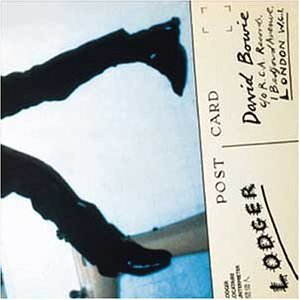
Image: David Bowie World collection / editorial use
Released in May 1979, Lodger completed what later became known as David Bowie’s Berlin Trilogy. While Low and “Heroes“ had introduced a new artistic direction, Lodger pushed experimentation even further — and its album cover reflected that adventurous spirit perfectly.
The sleeve is one of the most unusual in Bowie’s catalogue. Rather than presenting a glamorous portrait or carefully staged publicity photograph, Bowie appears as a battered accident victim frozen in mid-fall. The disturbing image was the result of an ambitious collaboration between photographer Brian Duffy, artist Derek Boshier and Bowie himself.
- Album: Lodger
- Released: 18 May 1979
- Photographer: Brian Duffy
- Design collaborator: Derek Boshier
- Camera: Polaroid SX-70
- Concept: Accident victim / falling body
- Label: RCA Records
- Part of: Berlin Trilogy
The Accident Victim Concept
Unlike most Bowie covers, the concept behind Lodger was deliberately unsettling.
Bowie wanted the image to look like a body caught in an awkward moment of impact or free fall. Rather than appearing glamorous or heroic, he would appear vulnerable, twisted and physically damaged.
The idea fitted the restless, fragmented nature of the music itself. Throughout the album, Bowie explored themes of travel, displacement and cultural dislocation. The cover visually reflected that sense of instability.
Brian Duffy and Derek Boshier
The sleeve emerged from a close collaboration between photographer Brian Duffy and British artist Derek Boshier.
Duffy had already become one of Bowie’s most important visual collaborators, having worked on several iconic projects throughout the 1970s.
Boshier brought a more conceptual and artistic perspective. Bowie admired his work and actively sought him out before the two eventually met through Duffy.
The partnership proved highly successful, producing one of the most ambitious visual projects of Bowie’s career.
How the Falling Effect Was Created
Many people assumed the cover image was simply a photograph of Bowie pressed against glass.
In reality, the effect was far more elaborate. A custom-built metal support was constructed inside Duffy’s London studio. Bowie lay on this specially designed frame while being photographed from above.
A wash basin was positioned beneath him to enhance the illusion of perspective. The finished image makes Bowie appear suspended between falling and impact.
The engineering behind the photograph was almost as important as the photography itself.
Behind the Cover Shoot

Image: davidbowieautograph.com / editorial use
This rare behind-the-scenes photograph reveals how the famous Lodger cover was actually created inside Brian Duffy’s North London studio.
Rather than lying directly on the floor, Bowie was positioned on a specially constructed metal support designed to remain hidden from the camera. The unusual setup allowed Duffy to photograph him from above while creating the illusion of a body suspended in mid-fall.
The image also shows assistants working around Bowie during the session. Thin fishing wires were attached to parts of his face and gently pulled in different directions to distort his features. These wires were later removed from the finished artwork.
The photograph demonstrates how much planning and technical experimentation went into the sleeve. What appears on the final album cover as a strange and disturbing accident scene was actually the result of careful engineering, makeup effects and photographic illusion.
Today, these production photographs are considered an important part of the history of the Lodger artwork, offering a rare glimpse into one of the most ambitious album-cover shoots of David Bowie’s career.
The Fish Wires and Facial Distortion
One of the most persistent myths surrounding the cover is that Bowie’s distorted face was caused by a sheet of glass pressing against him.
The actual effect was created using thin fishing wires attached to different parts of his face. Studio assistants gently pulled the wires in multiple directions while Duffy photographed the scene.
The wires were later removed from the final artwork, leaving only the strange and unsettling distortion behind.
The result helped make Bowie appear less like a rock star and more like the victim of a mysterious accident.
The Polaroid SX-70 Technique
The final sleeve image was photographed using a Polaroid SX-70 camera.
This choice gave the artwork a deliberately rough, low-resolution appearance. Instead of striving for technical perfection, Bowie and his collaborators embraced the imperfections of instant photography.
The grainy texture contributed to the feeling that viewers were looking at a recovered document or forensic photograph rather than a conventional album cover.
The Burned Hand
One of the most memorable details on the cover is the bandaged hand.
This was not a special effect. Shortly before the session, Bowie accidentally burned his hand with hot coffee.
Rather than hiding the injury, he insisted that the bandage remain visible in the photograph. The unexpected detail strengthened the accident-victim concept and became part of the final image.
Duffy’s Preferred Photograph
Interestingly, Brian Duffy originally preferred a different image from the session.
His favourite version showed a more extreme and disturbing facial distortion. Bowie ultimately selected a slightly less severe photograph for the finished sleeve.
The decision preserved the unsettling atmosphere while keeping the image visually balanced enough for a commercial album release.
The Gatefold Artwork
The creativity of the project extended beyond the front cover.
The original gatefold sleeve contained a collection of unusual and often disturbing imagery chosen by Bowie and Boshier.
Among the images were references to Andrea Mantegna’s Lamentation over the Dead Christ, photographs of Che Guevara after his death and additional production images from the cover session itself.
Together these elements created one of the most conceptually ambitious album packages of Bowie’s career.
Planned Accidents and Other Working Titles
Before settling on the title Lodger, Bowie considered several alternatives.
Among the documented working titles were Planned Accidents and Despite Straight Lines.
Both titles reflected ideas that also influenced the sleeve design: disruption, instability and unexpected movement.
Eventually Bowie chose Lodger, a title inspired partly by his increasingly international lifestyle and constant travelling during the late 1970s.
The Original Back Cover

Image: David Bowie World collection / editorial use
The original back cover of Lodger was more restrained than the disturbing front image.
Rather than presenting another dramatic portrait, the back sleeve focused mainly on typography, track information and album credits.
This sober design allowed the front cover and the gatefold artwork to remain the strongest visual statements of the package.
The contrast between the relatively functional back cover and the unsettling full gatefold image made the original LP sleeve even more effective as a complete visual object.
The Original Gatefold Artwork
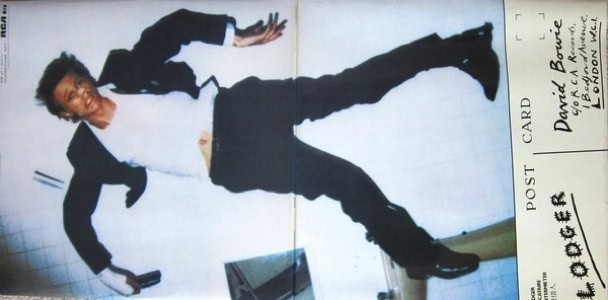
Image: David Bowie World collection / editorial use
The original Lodger gatefold sleeve revealed the complete accident-victim image created by Brian Duffy, Derek Boshier and David Bowie.
While the front cover showed only part of the composition, opening the sleeve exposed Bowie’s full body stretched across the image, making the “falling man” concept much more apparent.
The expanded artwork transformed the album into a visual experience rather than a simple record sleeve. The unusual body position, distorted perspective and unsettling atmosphere became even more striking when viewed across the entire gatefold.
Together with the interior imagery and conceptual design elements, the gatefold helped make Lodger one of the most ambitious and experimental packaging projects of Bowie’s career.
The Final Chapter of the Berlin Trilogy
Although the term “Berlin Trilogy” was popularised later, Lodger is generally regarded as the final part of the trilogy that began with Low and continued with “Heroes“.
Unlike the introspective atmosphere of Low or the dramatic grandeur of “Heroes“, Lodger looked outward. The songs drew inspiration from travel, geography and cultural encounters, creating one of Bowie’s most internationally minded records.
The album cover reflected this restless spirit. The image appears suspended between motion and impact, never quite settling into a fixed position.
A Cover Unlike Any Other
Few Bowie album covers are as immediately strange as Lodger.
There is no glamorous pose, no theatrical costume and no obvious alter ego. Instead, Bowie appears bruised, distorted and physically vulnerable.
That decision was entirely deliberate. The cover challenged expectations and demonstrated Bowie’s willingness to reject conventional rock-star imagery at a point when many artists would have chosen safer options.
The result remains one of the most distinctive sleeves of the late 1970s.
Legacy
Today, the cover of Lodger is regarded as one of David Bowie’s most inventive visual achievements.
The collaboration between Bowie, Brian Duffy and Derek Boshier produced an image unlike anything else in his catalogue. Through clever engineering, experimental photography and conceptual design, they created a sleeve that perfectly matched the adventurous spirit of the music inside.
The artwork also marked the end of an extraordinary creative period. Together, Low, “Heroes“ and Lodger transformed Bowie’s artistic identity and expanded the possibilities of both rock music and album design.
More than four decades later, the image of Bowie suspended between falling and impact remains one of the most memorable and unsettling photographs in rock history.
Article origin
This page was created using historically verified information surrounding the creation of the Lodger album cover, including documented interviews with Derek Boshier, Brian Duffy archive material, RCA Records artwork history and contemporary Bowie research sources.
Additional historical context was drawn from production photographs of the 1979 cover session, documented accounts of the Polaroid SX-70 photography process, surviving gatefold artwork materials and research into Bowie’s final Berlin Trilogy period.