
Low (1977) – The Story Behind the Album Cover
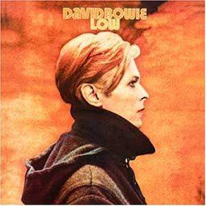
Image: David Bowie World collection / editorial use
Released in January 1977, Low marked one of the most dramatic artistic reinventions in David Bowie’s career. After the soul-infused sound of Young Americans and the dark elegance of Station to Station, Bowie unexpectedly delivered an album that was fragmented, experimental and deeply atmospheric.
The cover reflected that change perfectly. At first glance it appears simple: a profile image of Bowie against a bright orange background. Yet behind that apparently straightforward design lies one of the cleverest visual ideas in Bowie’s catalogue.
- Album: Low
- Released: 14 January 1977
- Cover image: Film still from The Man Who Fell To Earth
- Character shown: Thomas Jerome Newton
- Visual concept: “Low profile” visual pun
- Producer: David Bowie & Tony Visconti
- Collaborator: Brian Eno
- Label: RCA Records
The Man Who Fell To Earth Connection
Like the previous album Station to Station, the cover of Low used imagery connected to Nicolas Roeg’s 1976 film The Man Who Fell To Earth.
The image shows Bowie in profile as Thomas Jerome Newton, the alien character he portrayed in the film. Rather than commissioning a completely new portrait, Bowie chose to continue the visual association between the film and his evolving artistic identity.
By 1977, audiences often saw little distinction between Bowie, Newton and the various personas he created. The cover deliberately played with that ambiguity.
The Famous “Low Profile” Visual Pun
The sleeve contains one of Bowie’s most famous visual jokes.
The album is titled Low, and the cover shows Bowie in profile. Together they create the phrase “low profile”.
It is a simple idea, but also a remarkably effective one. After years of publicity, controversy and constant reinvention, Bowie was deliberately stepping back from public view. The image visually reinforced that withdrawal.
A New Beginning After Los Angeles
The period leading up to Low was one of the most turbulent in Bowie’s life.
After living in Los Angeles during the mid-1970s, he became increasingly uncomfortable with the city’s excesses and the lifestyle surrounding him. Seeking a healthier environment and greater artistic freedom, Bowie gradually relocated to Europe.
The music created during this period reflected a desire for renewal, and the cover mirrored that sense of personal and creative change.
The First Berlin Trilogy Cover
Although Low was not recorded entirely in Berlin, it is generally regarded as the first album in Bowie’s celebrated Berlin Trilogy, followed by “Heroes“ and Lodger.
The sleeve therefore occupies a special place in Bowie’s visual history. It marks the beginning of a new artistic chapter built around experimentation, atmosphere and European influences.
Compared to the elaborate theatrical imagery of earlier albums, the cover feels strikingly modern and restrained.
The Minimalist Design
One of the most remarkable aspects of the Low cover is its simplicity.
There are no costumes, no props, no dramatic scenery and no elaborate visual effects. The entire design is built around a single profile image and a bold colour field.
This minimalist approach matched the album’s artistic direction. Much of the music rejected conventional rock structures in favour of mood, texture and atmosphere.
Unlike the theatrical covers of the Ziggy Stardust era or the sophisticated glamour of Young Americans, the sleeve deliberately removed almost everything except Bowie’s profile.
The Orange Profile
The striking orange background became one of the defining visual elements of the album.
Combined with Bowie’s side profile and dark clothing, the design created an image that was instantly recognisable while remaining deceptively simple.
The result was one of the most iconic portraits in Bowie’s catalogue and one of the most distinctive album covers of the 1970s.
A Cover About Isolation
Many listeners have interpreted the sleeve as reflecting themes of isolation, distance and introspection.
Whether viewed as a portrait of Thomas Jerome Newton, the Thin White Duke or David Bowie himself, the image conveys a sense of separation from the outside world.
That emotional atmosphere perfectly complements the reflective mood found throughout much of the album.
The Original Back Cover
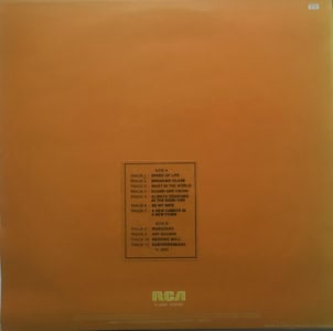
Image: David Bowie World collection / editorial use
The original back cover of Low continued the album’s minimalist visual philosophy.
Unlike many of Bowie’s earlier sleeves, the design avoided dramatic imagery and focused almost entirely on typography, credits and track information.
The simplicity reinforced the feeling that Low represented a clean artistic break from Bowie’s previous glam-rock and soul-era personas.
Together with the famous orange profile on the front cover, the restrained back sleeve helped create one of the most elegant and modern album packages of Bowie’s 1970s catalogue.
Critical Reception
When Low was released, both the music and the artwork confused many listeners. The album looked unlike almost anything Bowie had issued before.
Some critics struggled to understand the new direction, while others immediately recognised that Bowie was pushing beyond traditional rock conventions. The sleeve reflected that same artistic risk.
Over time, the cover came to be viewed as a perfect visual companion to the music. What initially appeared stark and unusual eventually became recognised as one of the most influential designs of Bowie’s career.
Legacy
The cover of Low remains one of David Bowie’s most intelligent visual statements.
By combining a film image, a visual pun and a minimalist design philosophy, Bowie created a sleeve that perfectly reflected a moment of artistic reinvention.
Nearly fifty years later, the orange profile remains one of the most recognisable images in rock music history and a defining symbol of Bowie’s Berlin-era transformation.
The sleeve demonstrated that an album cover could be powerful without being elaborate. Its simplicity became one of its greatest strengths and helped establish the visual identity of Bowie’s late-1970s work.
Article origin
This page was created using historically verified information surrounding the creation of the Low album cover, documented material relating to The Man Who Fell To Earth, Bowie’s European transition period, RCA Records artwork history and contemporary Bowie archive sources.
Additional historical context was drawn from interviews with Bowie and his collaborators, documented studies of the Berlin Trilogy period and research into the visual symbolism of the album’s famous “low profile” concept.